We turned the lens on ourselves and built an identity system that reflects how we work: precise, geometric, warm.
The challenge
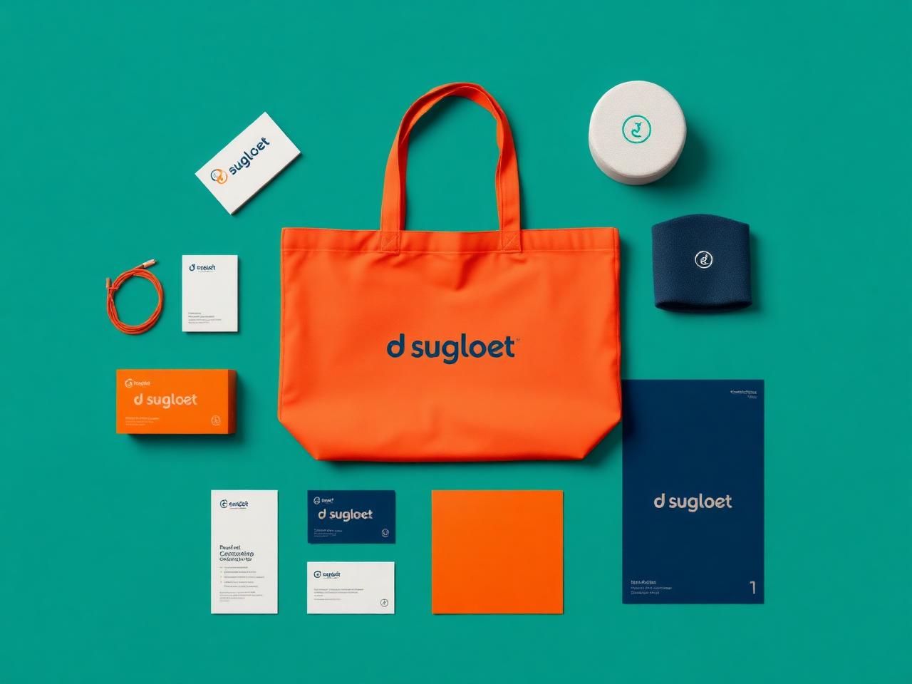
We needed a mark and system flexible enough to live across web, print, motion and merch — while still being instantly recognisable in a sea of agency brands.
Our approach
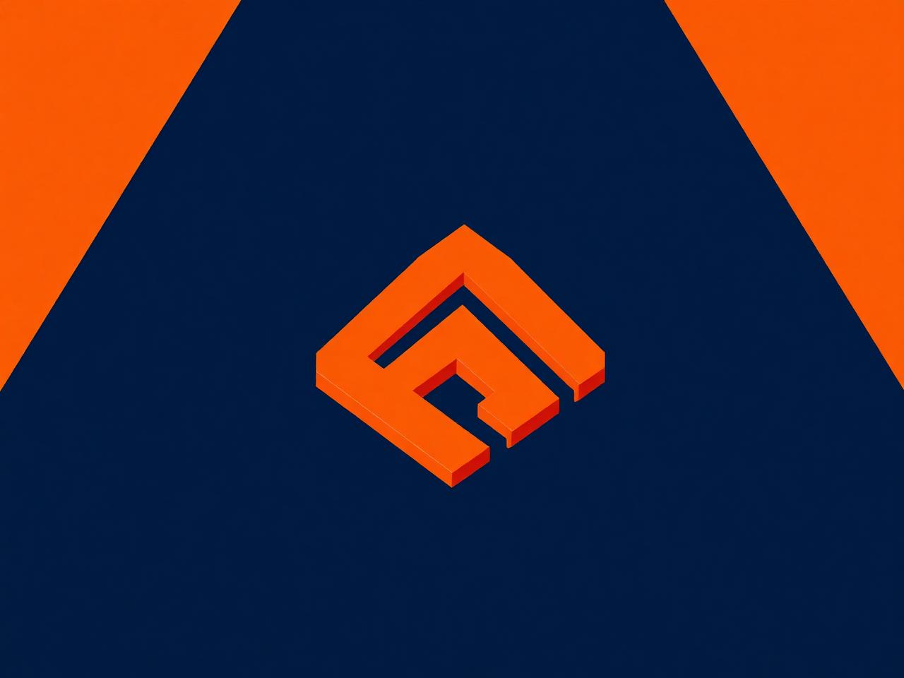
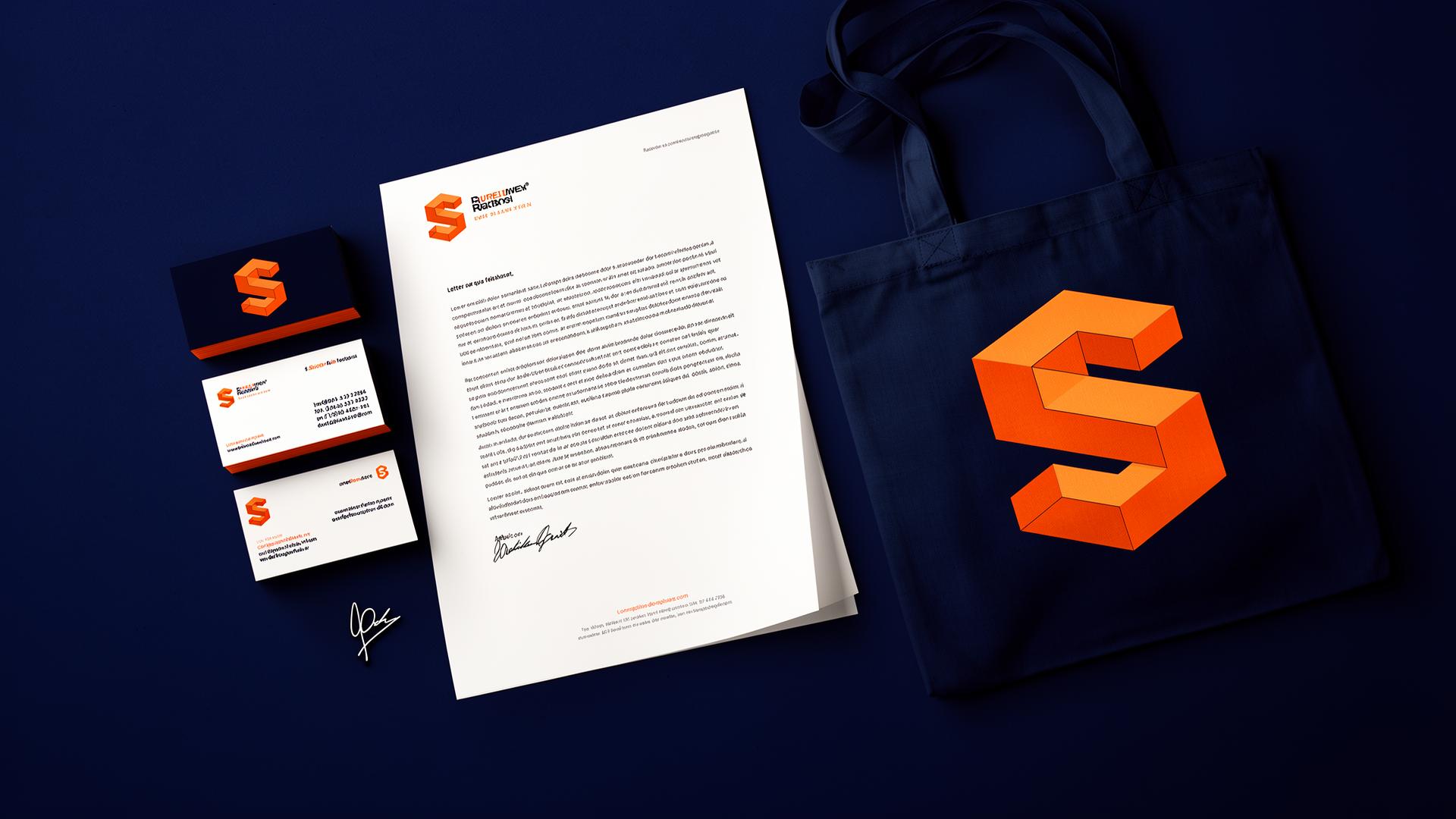
We grounded the system in an isometric construction grid. The ‘S’ mark hides an ‘I’ in negative space — a quiet nod to our name. A confident orange and deep navy palette with Host Grotesk typography make the system feel modern and grown-up.
The outcome
The new identity has become a calling card. Clients reference our visual language as a reason for hiring us.
1
Versatile mark
16+
Brand applications
∞
Iterations refined
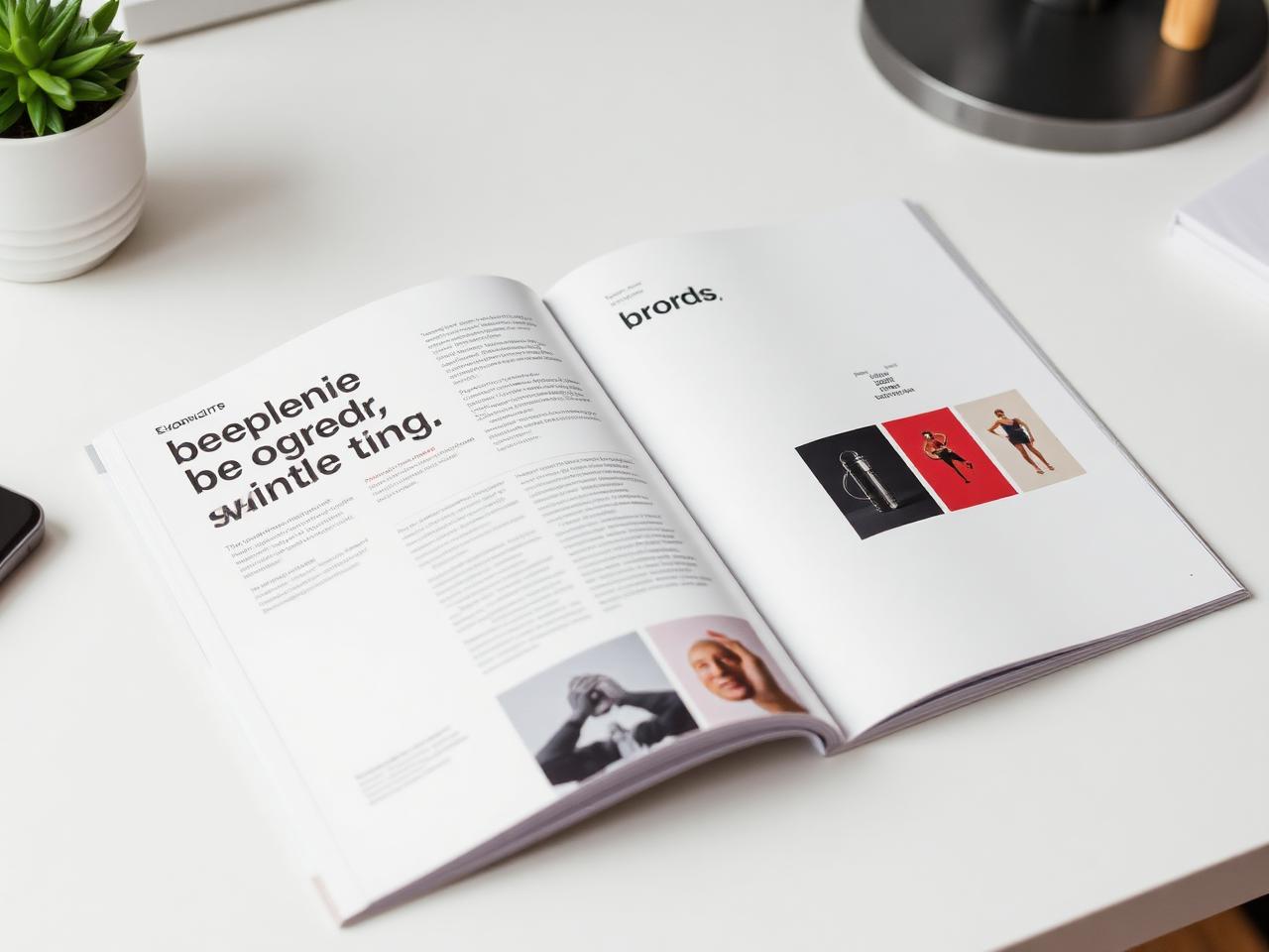
Gallery
A closer look.